Le Corbusier Pavilion: An Enlightening Look Into Modernist Architecture
2 Jun 2023 by Amby


I generally do not like modernist architecture, which I find boring, utilitarian, and (sometimes) extremely hideous. So I was not overly excited to check out Le Corbusier Pavilion, along Zurich’s lake front promenade.
But I have to admit, I really enjoyed this visit and learned a lot about modernism, finding new appreciation for the thinking behind it, if not the aesthetics itself.
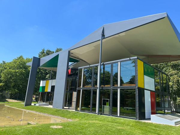
Entrance:
I got the Swiss Museum Pass (177 CHF) so entrance was ‘free,’ but normally it costs 12 CHF.
Because the building is set perpendicular to the main road, finding the entrance was a bit tricky, and I circled the building once before seeing it.
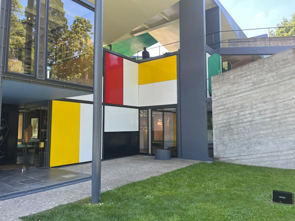
The Building:
As the exhibits explain, the Pavilion was created as an artistic concept, not as a real house that people are meant to live in.
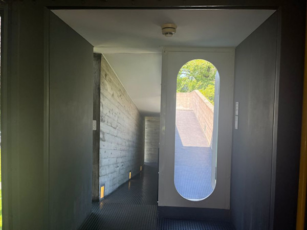
Visitors had access to the three floors, the basement, and the roof, via a staircase and a ramp. Le Corbusier thought ramps were a more leisurely and dignified way to move between floors, but included the stairs for speed.
There are activities for kids to do to design and color their own paper furniture, which was neat.
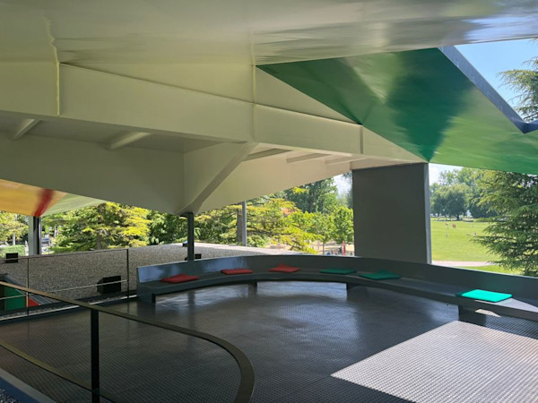
An audio guide explaining the history and design concepts was provided via an app, and I sat on the lovely roof area to listen to all of it before touring the whole house.
Le Corbusier and Modernism:
I always found modernist buildings to be anti-human and unsympathetic to humane aesthetic senses.
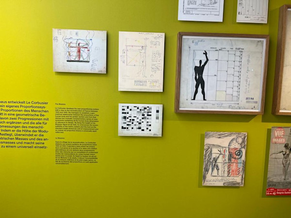
But I was genuinely surprised to learn a leading modernist thinker like Le Corbusier was actually an avid student of humans and nature, and devoted a lot of time and energy into thinking about the proportions necessary to achieve comfort in his designs.
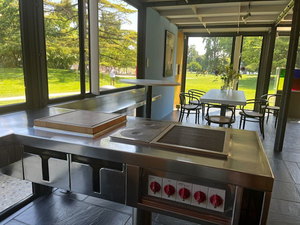
And indeed, I did find the house to be comfortable and charming on the inside, and especially liked the chairs and benches.
There are much lower than what we are used to, but do provide a better vantage of the surrounding space and were overall nice to sit in.
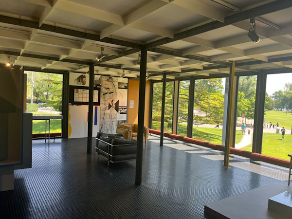
Le Corbusier was all about the “modular,” or creating designs that could build off of each other and be added on to. He got these ideas of replicating patterns from nature.
While I still disagree with much of modernist design philosophy and enjoy earlier forms of design in Europe so much more, I can’t deny the genius behind Le Corbusier, or his impact on the world of art.
If you’re looking for something a little different to break up your lake-side walk, this is an enjoyable and edifying option.


Write a comment